


- Futura. The very name brings to mind jet-age splendor of the highest order, and indeed the text on the commemorative plaque left behind on the Moon by the Apollo 11 astronauts in July, 1969 is set in Futura. There is no other font that can do what it does with the same impact. You might say Futura is to Helvetica as driving a Porsche is to driving a Toyota--they both get you there, but the former does it with so much more fun.
- Futura was designed by type design luminary Paul Renner, and is used extensively in advertising and logo design, by IKEA, Volkswagen, Shell, HP and many more. Used in any headline or body situation, Futura can bring you all the magic, promise and forward-looking sans power in an iconic and powerful way, as director Stanley Kubrick knew--it was his favorite font.Commissioned by the Bauer type foundry, Futura was commercially released in 1927.
Futura Font Family - 20 Font 580€
TTF | 474 KB
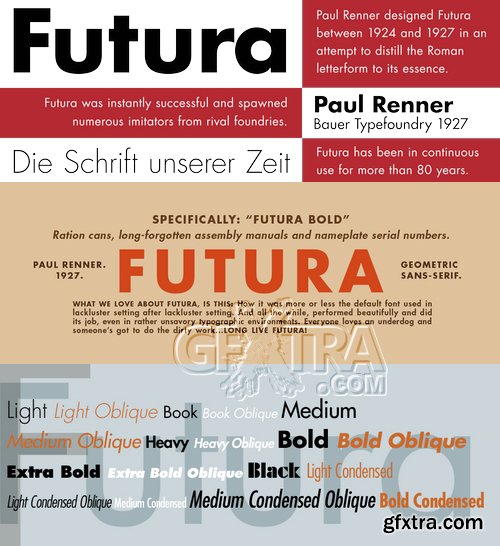
First presented by the Bauer Type Foundry in 1928, Futura is commonly considered the major typeface development to come out of the Constructivist orientation of the Bauhaus.movement in Germany. Paul Renner (type designer, painter, author and teacher) sketched the original drawings and based them loosely on the simple forms of circle, triangle and square. The design office at Bauer assisted him in turning these geometric forms into a sturdy, functioning type family, and over time, Renner made changes to make the Futura fonts even more legible. Its long ascenders and descenders benefit from generous line spacing. The range of weights and styles make it a versatile family. Futura is timelessly modern; in 1928 it was striking, tasteful, radical - and today it continues to be a popular typographic choice to express strength, elegance, and conceptual clarity. Typefaces in the same style like Futura are: Avenir, Metromedium, Neuzeit Grotesk,

CreativeMarket - Futura Font Suite for Book & Text 2583336
OTF, TTF, All Files

https://www.myfonts.com/fonts/neufville/futura-nd-display/
Futura ND is part of Neufville Digital’s BAUER CLASSICS collection. Futura ND Black was completely digitized anew from the original sources of the Bauersche Giesserei, now held by Bauer Types, SL in Barcelona.

Futura Black Font Family
Originally drawn by Josef Albers in 1926 at the Bauhaus, then later composed as a typeface by Paul Renner in 1929. URW now brings us this design classic digitized and ready via opentype format.

https://www.myfonts.com/fonts/wiescherdesign/futura-classic/
FuturaClassic is a recut of Paul Renners original Futura. This version was what Mr. Renner wanted the Futura to look like. He had to change his very stringent design because the market wanted a more pleasing typeface. I think the original design is worth saving because it is much more typical and has a personal and distinguished touch. I have also designed Geometra Rounded with rounded endings that looks more interesting than your usual DIN type.

https://www.myfonts.com/fonts/efscangraphic/futura-sh/
Since the release of these fonts most typefaces in the Scangraphic Type Collection appear in two versions. One is designed specifically for headline typesetting (SH: Scangraphic Headline Types) and one specifically for text typesetting (SB Scangraphic Bodytypes). The most obvious differentiation can be found in the spacing. That of the Bodytypes is adjusted for readability. That of the Headline Types is decidedly more narrow in order to do justice to the requirements of headline typesetting.
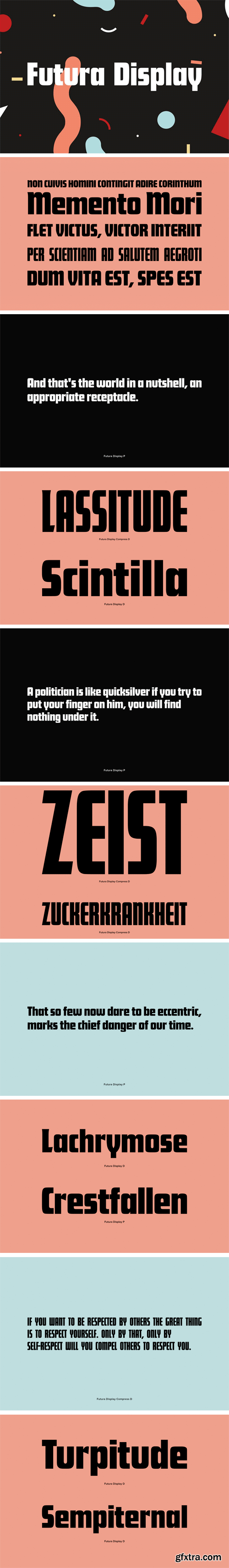
https://www.youworkforthem.com/font/T1026/futura-display
Released in 1932, Futura Display (Futura Schlagzeile) uses more angular strokes than the traditional design, resulting in rectangular letter forms. Designed by Paul Renner.
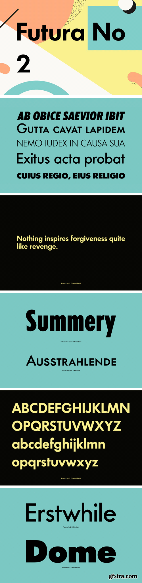
https://www.youworkforthem.com/font/T0990/futura-no-2
Futura No. 2 is Letraset's version of Futura from the 1980s, digitized by and at URW in opentype format. Futura. The very name brings to mind jet-age splendor of the highest order, and indeed the text on the commemorative plaque left behind on the Moon by the Apollo 11 astronauts in July, 1969 is set in Futura. There is no other font that can do what it does with the same impact. You might say Futura is to Helvetica as driving a Porsche is to driving a Toyota--they both get you there, but the former does it with so much more fun.
Futura was designed by type design luminary Paul Renner, and is used extensively in advertising and logo design, by IKEA, Volkswagen, Shell, HP and many more. Used in any headline or body situation, Futura can bring you all the magic, promise and forward-looking sans power in an iconic and powerful way, as director Stanley Kubrick knew--it was his favorite font.
SermonBox - Seasonal Collection

SermonBox - The Series Pack Collection

Top Rated News


Would you like to be a Author?


